How to Organize a News Site Into Sections People Recognize
News sites face a unique challenge when it comes to organizing content. With an ever-growing flow of stories spanning politics, sports, culture, and local events, a clear, intuitive structure is essential. Without it, readers can quickly feel overwhelmed and lost in a sea of articles — suffering from what UX experts call "choice overload."
In this post, we’ll explore practical strategies to organize your news site using editorial sections that resonate with readers, emphasize label clarity, and balance browsing and search behaviors. We’ll also highlight how smart site navigation and leveraging a site search box can complement each other to create a publisher UX that feels seamless and https://bizzmarkblog.com/how-to-decide-which-filters-to-show-first-a-guide-to-effective-filter-prioritization/ welcoming.

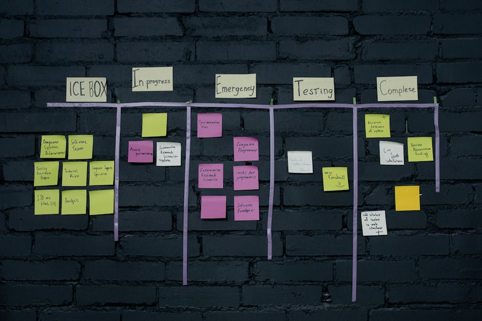
Understanding the Problem: Choice Overload is an Organization Issue
Choice overload occurs when users are confronted with too many options without clear guidance or grouping, leading to decision paralysis. On news sites, the temptation to show every beat, every niche topic, and every category at once can backfire:
- Readers don’t know where to start.
- Important stories get lost within an undifferentiated mass.
- Users abandon the site in frustration or rely solely on search, bypassing editorial curation.
This is not just a matter of cramming content into menus or dropdowns. It’s fundamentally an information architecture (IA) problem — how your content is grouped, labeled, and prioritized as part of the overall product experience.
Editorial Sections as a Mental Map
People make sense of information by creating mental maps: internal models of how content is organized. Editorial sections provide this map-making by grouping content around familiar, meaningful concepts.
Why Editorial Sections Matter
- Clarity: Clear, recognizable sections like “Politics,” “Sports,” or “Technology” align with what users expect to see, reducing cognitive load.
- Navigation: Sections anchor site navigation, allowing users to browse intuitively rather than guess at where content might live.
- Trust: A straightforward structure builds confidence in the site’s authority and editorial judgment.
Best Practices for Defining Sections
- Start with user research: Analyze search queries, popular stories, and audience feedback to uncover dominant themes readers care about.
- Limit sections to a manageable number: Aim for 5–8 primary sections for desktop navigation, preventing overwhelming users with options.
- Think hierarchy: Use sub-sections judiciously beneath broad topics when necessary, but avoid deep nesting that buries content.
- Test label clarity: Avoid jargon or clever naming. For example, “World News” trumps “Global Perspectives” when clarity matters most.
The Role of Label Clarity in Publisher UX
Label clarity is often overlooked, but vital in news site navigation. How you name your sections and menu items directly influences a reader’s ability to quickly scan and find what they want or expect.
A few guidelines to follow:
- Use plain language: Readers bring their own vocabulary and associations; your labels should mirror this language.
- Avoid overly clever or brand-centric labels: They lead to confusion and require mental effort to decode.
- Be consistent: If the section is "Opinion" in the menu, don’t call it "Editorials" elsewhere.
- Test labels externally: Run quick usability sessions or ask real users — even your mom! — “Where would you click to find [topic]?”
Site Navigation: Integrating Sections and Search
While editorial sections support browsing, site search addresses different user behavior — purposeful looking for specific content.
Browsing Behavior
Many readers arrive without a specific article in mind and prefer to explore categories or sections. Navigation menus, tabs, and homepage layouts facilitate this exploratory browsing, guiding users through the editorial map you’ve created.
Search Behavior
Other visitors come with a clear intent — a particular person, event, or term in mind. For them, a prominent, well-functioning site search box is crucial.
However, search should never be a substitute for good organization. If users must rely on search because navigation is confusing or non-existent, you risk frustrating less savvy readers or those who prefer to browse.
Balancing Both
Aspect Good Editorial Sections Effective Site Search User Behavior Supports browsing/exploration of content themes Caters to goal-oriented, lookup users Navigation Role Primary navigation anchor points Quick access to specific articles and topics UX Impact Builds mental map and decreases choice overload Speeds finding precise content when needed Common Pitfalls Overcomplicated taxonomies, confusing labels Failing search box, poor result relevanceInformation Architecture as Part of the Product
You ever wonder why good ia is not a back-end detail or a one-off setup. It’s a product decision that affects the entire user experience, editorial strategy, and business goals.
- Editorial teams: Need to coordinate on how content is categorized from day one.
- Design and UX teams: Must integrate navigation choices into wireframes and prototypes, testing proposed structures before launch.
- Development teams: Should enable flexible taxonomy backend systems that allow editorial teams to adapt categories and sections over time.
By treating IA as a core product pillar, publishers can create a site navigation system that aligns with both their content goals and user needs — reducing friction and increasing engagement.
Summary: Organizing for Recognition and Usability
To summarize the keys for organizing a news site into recognizable sections that improve publisher UX:
- Define editorial sections as mental maps: Group stories into clear, manageable high-level categories that make sense to your audience.
- Use label clarity: Choose simple, descriptive names that your readers understand immediately.
- Balance browsing with search: Provide a prominent site search box for goal-directed users, but don’t neglect intuitive navigation and editorial grouping.
- Address choice overload through good IA: Structure your content so readers don’t have to confront overwhelming options.
- Make IA a continuous product conversation: Collaborate across teams and iterate based on user data and feedback.
Navigational clarity is not merely a convenience — it shapes how readers perceive your news brand, find value, and how to categorize website content return again and again. When editorial sections truly resonate, and site navigation feels natural, your news site becomes more than an information repository — it becomes a trusted daily companion.